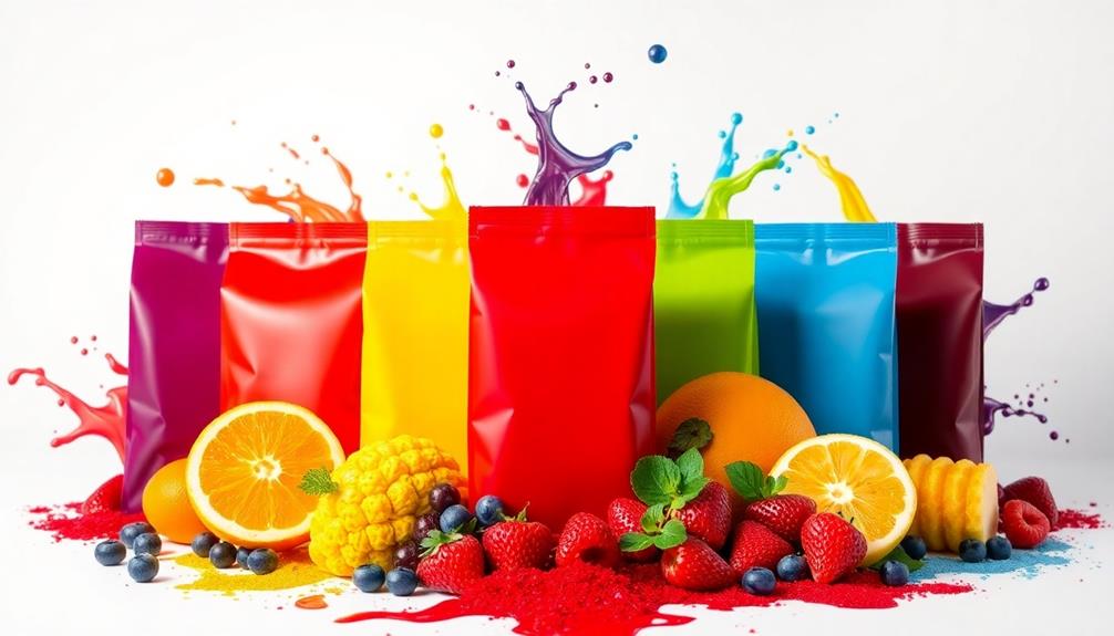
Packaging color plays an essential role in how you perceive taste. It shapes your expectations before you even sample the product. For instance, red often hints at sweetness, while blue suggests saltiness. Warm colors like yellow evoke feelings of indulgence, whereas cool colors, like green, imply health. Your quick decisions—sometimes made within just 2.5 seconds—are heavily influenced by these visual cues. By strategically using color in packaging, marketers can enhance product appeal and consumer trust. There's much more to discover about how these choices impact your taste experiences.
Key Takeaways
- Color significantly shapes taste expectations, with red suggesting sweetness and blue indicating saltiness before consumption.
- Warm colors evoke indulgence and comfort, while cool colors imply healthfulness and trust in product choices.
- High color saturation enhances perceived taste intensity, influencing consumer preferences and impulsive buying decisions.
- Packaging color alignment with product characteristics enhances desirability and shapes overall consumer taste evaluations.
- Marketers can strategically use color psychology to attract target audiences and foster consumer engagement through effective packaging design.

Color in Food: Technological and Psychophysical Aspects
As an affiliate, we earn on qualifying purchases.
As an affiliate, we earn on qualifying purchases.
Understanding Color Psychology
Color psychology plays an essential role in how you perceive taste before even taking a bite. The packaging color of a product can greatly shape your taste expectations. For instance, when you see popcorn in red packaging, you might expect it to be sweeter, while blue packaging could lead you to perceive it as saltier. This isn't just a coincidence; it's tied to your past experiences and how color influences consumer perception.
Certain dishes, like Red-Braised Pork Belly, often evoke rich flavors that can be amplified by their presentation and packaging colors. Warm colors like red and yellow often evoke feelings of indulgence, hinting at richer flavors and lower health perceptions. In contrast, cool colors such as green and blue promote a sense of calmness and healthfulness, subtly guiding your food choices.
Additionally, the intensity of color saturation can enhance your perception of taste intensity. Highly saturated colors often lead to stronger taste experiences, making you more likely to expect bold flavors.
Ultimately, understanding color psychology can help you navigate your own food choices more effectively. By recognizing how packaging color influences your taste expectations, you can make more informed decisions, whether you're snacking on popcorn or selecting your next meal.

Sensory Nudges: The Influences of Environmental Contexts on Consumers' Sensory Perception, Emotional Responses, and Behaviors toward Food and Beverages
As an affiliate, we earn on qualifying purchases.
As an affiliate, we earn on qualifying purchases.
Color Associations With Taste
When you see a product's packaging, your brain automatically links certain colors to specific taste expectations. For instance, you might expect a red package to be sweeter, while blue could hint at saltiness.
These color associations not only shape your taste perceptions but also trigger emotional responses that influence your overall experience with the product.
This phenomenon is similar to how certain colors in Brazilian cuisine, such as the vibrant hues of dishes like Cuscuz Paulista, can evoke specific flavor profiles and cultural connections.
Understanding these associations can enhance your appreciation of the diverse flavors found in traditional dishes.
Color Psychology in Packaging
Many people don't realize how much packaging color influences their taste perceptions. The colors you see can shape your consumer expectations even before you take a bite. For instance, red is often associated with sweetness and arousal, while blue tends to evoke saltiness. This means that the color of product packaging can considerably alter how you evaluate taste.
| Color | Taste Association |
|---|---|
| Red | Sweetness, Arousal |
| Blue | Saltiness |
| Yellow/Orange | Indulgence |
| Green | Healthfulness, Sustainability |
Experimental studies show that popcorn in red bowls is rated 3.7% sweeter than in white bowls, highlighting the power of visual cues. Additionally, color saturation plays a role; highly saturated colors suggest more intense taste experiences. Warm colors like yellow and orange attract you to indulgent foods, while cool colors like blue and green promote healthful perceptions.
In just 2.5 seconds, you make decisions based on these visual cues, demonstrating how important packaging color is in shaping your taste perception and purchasing choices.
Taste Expectations by Color
Certain colors can dramatically influence your taste expectations, shaping how you perceive flavors even before you take a bite. For instance, if you see red packaging, you might expect your snack to be sweet and exciting. Research shows that popcorn served in red bowls is perceived as 3.7% sweeter than when it's in white bowls.
On the flip side, blue packaging often leads you to expect saltiness, with a 4% increase in perceived saltiness for blue bowls compared to white. This phenomenon isn't unlike how culinary traditions from around the world, such as the vibrant colors of dishes like Kedjenou, can evoke specific taste associations and cultural expectations.
Warm colors like yellow and orange create associations with indulgent and comforting foods, while cool colors such as green and blue evoke feelings of healthfulness and trust. This considerably affects consumer perceptions of taste and quality.
Additionally, the brightness and saturation of packaging color can enhance your expectations, as highly saturated colors amplify stimulus intensity.
Ultimately, your taste ratings can shift based on these color-triggered expectations, illustrating how packaging color not only influences your initial impressions but also your overall taste evaluations.
Emotional Responses to Colors
The emotional responses you have to colors can considerably influence your taste perceptions. When you see packaging in certain colors, it might shape your expectations and experiences with the food inside. For example, red packaging often ignites feelings of excitement and sweetness, leading you to anticipate a sugary treat.
In contrast, blue packaging may evoke a sense of saltiness, altering your taste perception before you even take a bite. Colors can also set the mood for themed events, like how vibrant colors in Halloween treats, such as Graveyard Taco Dip, can enhance the overall experience.
- Red packaging: Associated with sweetness, sparking excitement.
- Warm colors: Like yellow and orange, suggest energy and indulgence, but may lower health perceptions.
- Cool colors: Green and blue are often linked to healthfulness and sustainability.
- Pink packaging: Evokes nostalgic memories of sweetness, enhancing expectations.
These emotional responses directly affect consumer expectations and choices. You might find that popcorn in red bowls tastes sweeter than in white, proving how packaging color can manipulate your taste perception.

WIKDAY Cellophane Bags 100 PCS 6×10 Inches Clear Gift Gags with Ties Plastic Treat Party Favor Candy Bags for Gift Giving, Packaging Snack, Products
▶What You Will Get◀ Pack of 100 6×10 Inches cellophane bags with twist ties .Gift wrapping, Small business,…
As an affiliate, we earn on qualifying purchases.
As an affiliate, we earn on qualifying purchases.
The Role of Packaging in Marketing
The Role of Packaging in Marketing
In a crowded marketplace, packaging plays an essential role in marketing strategies, often serving as the final touchpoint that influences consumer decisions. The color of packaging can notably shape consumer expectations and taste impressions. For instance, yellow often signals sweetness, making it a popular choice for dessert items, while black might evoke bitterness. These anticipatory cues set the stage for how you perceive a product even before you taste it.
Additionally, packaging can evoke sensory associations, such as the comforting feel of a holiday meal like Turkey Soup or the festive spirit of a vibrant drink like cranberry punch. You typically spend just 2.5 seconds choosing a product, relying heavily on visual cues like packaging color. This means that effective packaging design must align with product characteristics to enhance product desirability. When you see a well-designed package that resonates with your expectations, you're more likely to feel compelled to make a purchase.
Moreover, the marketing influence of packaging extends beyond just aesthetics. It can also affect your health perceptions, shaping your overall impression of a product. By strategically using colors and design elements, brands can create a cohesive narrative that captures your interest and drives buying behavior.
Ultimately, the right packaging can make all the difference in a consumer's decision-making process.

Food packaging and purchasing behaviour in France and Japan: The influence of food packaging colour on consumer purchase intention in France and Japan
As an affiliate, we earn on qualifying purchases.
As an affiliate, we earn on qualifying purchases.
Experimental Methodology Overview
In this section, you'll explore the participant selection criteria and the design of the color-taste experiment.
To guarantee a thorough understanding, we'll consider various food items, including those known for their rich flavors, such as Nettle and Potato Soup, which may be influenced by packaging color.
You'll also look at the data analysis techniques used to assess the impact of packaging color on taste perceptions.
This approach guarantees a clear understanding of how color influences expected flavors in a controlled setting.
Participant Selection Criteria
A total of 60 participants were carefully selected for this study to guarantee a balanced representation of gender and a mean age of 20.45 years. To ascertain the reliability of our results, all participants were screened for the absence of sensory disorders, so underlying health issues wouldn't skew sensory perceptions.
Additionally, participants were chosen based on their familiarity with various flavor profiles, similar to how individuals might enjoy a rich blend of spices in dishes like Mushroom Masala.
Here are some key aspects of the participant selection criteria:
- Balanced gender distribution
- Mean age of 20.45 years
- No reported sensory disorders
- Familiarity with taste expectations related to packaging color
Each participant rated their taste expectations based on popcorn packaged in four different colors—red, yellow, blue, and white—using a Likert 9-point scale. This allowed us to gauge visual perceptions and how they influenced taste expectations.
The data collected were analyzed with a repeated-measures ANOVA, focusing on the expected versus actual taste scores. This thorough approach ensured that the impact of packaging color on perceived taste was assessed effectively, laying the groundwork for understanding how visual cues can shape our taste experiences.
Color-Taste Experiment Design
To explore the impact of packaging color on taste expectations, researchers designed a robust experiment involving 60 participants who rated their perceptions of popcorn packaged in four distinct colors: red, yellow, blue, and white. This investigation is reminiscent of how color influences the enjoyment of various foods, such as the vibrant hues found in traditional Japanese confectioneries like Dorayaki (Red Bean Pancake).
Before tasting the popcorn, you assessed your taste expectations using a 9-point Likert scale, focusing on perceived sweetness and saltiness based on the packaging color. This approach allowed for a clear comparison between what you expected and the actual taste experience.
The experiment design was meticulously structured to guarantee valid results. Participants were screened for sensory disorders, and the study maintained a balanced gender distribution with a mean age of 20.45 years.
Once the taste evaluations were completed, the researchers utilized repeated-measures ANOVA (MANOVA) to analyze the data. The findings revealed significant effects of packaging color on taste perception (p < 0.0001).
Importantly, red packaging led to higher perceived sweetness, while blue packaging was linked to increased saltiness. This highlights the profound influence of color on taste expectations, emphasizing the importance of packaging design in consumer products.
Data Analysis Techniques
Data analysis techniques played an essential role in uncovering the relationship between packaging color and taste expectations in this study. You'll find that the methodology was robust, involving 60 participants with a balanced gender distribution and an average age of 20.45 years.
After presenting participants with popcorn in four different colored packaging—red, yellow, blue, and white—they rated their taste expectations using a 9-point Likert scale. The influence of visual cues is similar to how diners present classic American comfort food to enhance expectations, such as the vibrant presentation of a loaded baked potato.
The primary analysis employed repeated-measures ANOVA (MANOVA), revealing significant effects of packaging color on taste perceptions (p < 0.0001). To explore further, paired-sample t tests showed that participants' expectations based on packaging color often exceeded their actual taste evaluations, underscoring the influence of visual cues.
Here are some key highlights from the data analysis:
- 60 participants provided diverse insights.
- 9-point Likert scale captured nuanced taste expectations.
- MANOVA revealed significant color impact on perceived taste.
- Systematic approach with 12 popcorn servings explored color-taste combinations.
These techniques not only validated the findings but also emphasized how packaging color shapes our expectations and perceptions of taste.
Key Findings and Insights
Research consistently reveals that packaging color plays an important role in shaping taste perceptions. For instance, red packaging is linked to higher sweetness expectations, resulting in a 3.7% increase in perceived sweetness compared to white packaging. In contrast, blue packaging correlates with a 4% increase in perceived saltiness.
A study involving 60 participants confirmed notable differences in taste expectations based on packaging color, showcasing how colors influence your perceptions. This phenomenon is similar to how traditional dishes, such as Muamba De Galinha, are often associated with specific colors and ingredients that shape cultural taste expectations.
Warm colors, such as yellow, greatly enhance sweetness expectations, as seen when participants rated popcorn with yellow packaging higher than that in white. This indicates that your taste ratings can shift based on initial color-triggered expectations.
Additionally, angular shapes combined with saturated colors can boost product appeal and positively influence perceived taste.
These insights underscore how crucial it's for brands to evaluate packaging color when aiming to enhance consumer preferences. By strategically using colors that align with consumer expectations, brands can effectively shape your taste perceptions, ensuring their products stand out in a competitive market.
Consumer Expectations and Behavior
Packaging color greatly shapes consumer expectations and behavior, often influencing purchasing decisions in just a matter of seconds. You mightn't realize it, but the hue of a product's packaging can considerably impact your taste perception.
For example, you'll likely perceive popcorn in a red bowl as sweeter than in a white one, while blue bowls make it seem saltier. This quick judgment often relies on visual cues, as studies show consumers spend an average of 2.5 seconds selecting products.
Consider these points:
- Warm colors like red and orange enhance the appeal of indulgent foods.
- Cool colors such as green and blue boost health perceptions.
- Color alignment with nutritional claims fosters consumer trust.
- Quick color-based judgments can lead to impulsive purchasing decisions.
Understanding the relationship between packaging color and consumer expectations is essential. While warm colors may entice you to indulge, they can also lower your health perceptions.
Conversely, cool colors can make products appear healthier. Recognizing these dynamics can help you make more informed choices while shopping.
Practical Applications for Marketers
Color plays an essential role in how consumers perceive products, and marketers can harness this power to shape taste expectations effectively. By understanding color psychology, you can increase product appeal and influence consumer perceptions. For indulgent products, using warm colors like red and yellow can evoke sweetness and excitement, enhancing expected taste sensations. In contrast, cool colors such as green and blue work well for health-related products, conveying trust and healthfulness.
Here's a quick reference table to guide your packaging color choices:
| Color | Taste Expectation | Ideal Product Type |
|---|---|---|
| Red | Increased sweetness (up to 3.7%) | Indulgent snacks/desserts |
| Yellow | Excitement | Fast food, sugary drinks |
| Green | Healthiness | Low-calorie, organic items |
| Blue | Trustworthiness | Nutritional supplements |
| High Saturation | Stronger taste sensations | Any category with vibrant appeal |
Frequently Asked Questions
How Does Packaging Affect Taste Perception?
Packaging affects taste perception by creating visual expectations. You rely on colors and designs to judge flavors quickly, often associating certain hues with sweetness or saltiness, which shapes your overall eating experience and enjoyment.
How Does Color Affect the Perception of Taste?
Color's like a magician, transforming your taste perceptions. When you see vibrant hues, your brain anticipates flavors differently. Red whispers sweetness, while blue hints at saltiness, shaping your experience before you even take a bite.
How Does Colour Affect People's Perception of Food?
Color affects your perception of food by influencing your expectations and emotions. Bright, warm colors might make you crave indulgence, while cool tones often promote feelings of calm and health, shaping your overall eating experience.
What Role Does Color Play in Packaging of Food?
Color in food packaging is like a siren's song, drawing you in. It sets the mood, influences your expectations, and shapes your experience. Bold hues entice; soft tones comfort—each color tells a delicious story waiting for you.
Conclusion
In a world where a simple color can transform a bland snack into a gourmet delight, you've got to embrace the power of packaging! Imagine a vibrant red box that screams "delicious" or a serene blue wrapper that whispers "refreshing." By understanding how colors influence taste perceptions, you can elevate your brand to dizzying heights of desirability. So, don't just pick colors; choose hues that tantalize the senses and leave consumers craving more!


